
What Are Pictographs?
People have been using pictures for conveying information since ages. We use pictographs for the same purpose including the similar principles. Pictographs refers to the data representation by using different images. There is a data frequency including the symbol's usage with relevant details. With it, we can easily represent the statistical data and pictograph credibility is so easy. There are different ways of making pictographs that enough to understand the pictograph; Assign a key - Sometimes, data frequency is high as there is no sign to represent a single frequency. There must be a single numerical value to represent a single symbol. You will write it with the pictograph. Data collection - Categorize data to represent it well by collecting it well. It will work well when you done appropriately then, you will make list to represent the data. There is a data reviewing once you start pictography. Symbol collection - You will select only those symbol that shows your data with a picture or symbol. There is a TV set representation through pictography then, you use basketball. What do you think is it a right practice? Nay! It creates a confusion. Data review - Review your pictograph to show the data accurately. It would be dependent information as you don't forget to check your graph's labelling.
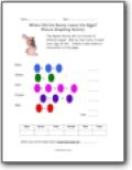
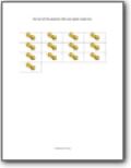
Where Did the Bunny Leave the Eggs?
The Easter Bunny left us a bunch of different eggs! Add up how many of each color egg he left. Create a data table on the bottom of the page.
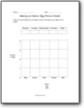
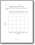
Making an Easter Egg Picture Graph
Copy your data table from the graph activity and paste your eggs on the graph.

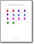
Interpreting an Easter Egg Picture Graph
The graph below shows the colors of the different eggs the Easter bunny left. Answer the questions below.
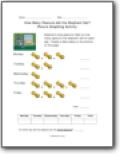
How Many Peanuts did the Elephant Eat?
Elephants love peanuts! Add up how many peanuts the elephant ate for each day. Create a data table on the bottom of the page.
Making a Peanut Picture Graph
Copy your data table from page 1 and paste your peanuts from page 2 into the graph.

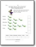
How Many Worms did the Bird Eat?
Add up how many worms the bird ate for each day. Create a data table on the bottom of the page.

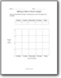
Making a Worm Pictograph
Copy your data table from page 1 and paste your worms from page 2 into the graph.

Interpreting Pictographs
The graph below shows how many worms a bird ate each day. Answer the questions below.