What Are Graphs and How Do They Help Us?
Graphs are a tool that we use to take data and visualize it. When we manipulate the data to allow it to be seen as an image it makes it much easier for us to interpret and see what is going on with the data. We can, in many cases, spot patterns and trends within the data. Once we recognize this, we can make accurate forecasts and predictions on future data. Graphs are often confused or used in place of the word charts. Charts are more used for organizing data so that it is easier to use or concisely stated. Charts are not used for making conclusions or projections. Graphs come in many different forms. We choose to use the different types based on our purposes. Line graphs are used to display or analyze how data evolves over a period of time. Bar graphs are more often used to compare two or more data sets or categories of data. Pictographs are often used as an alternative to charts, they are more used for show, not substance. Pie or circle graphs are used to compare parts or fractions of a whole. This is good to use when you evaluating an organization or sub-parts within it. There are types of graphs that are focused on certain branches of math such as histograms and box and whisker plots. They are used for statistical analysis.
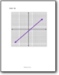
Coordinate Graphing
We work on applying the scientific method to a hunch that we may have.
Advanced Graphing
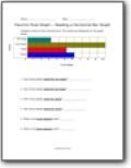
We explore the types of graphs you would use to analyze larger data sets for more advanced applications such as lab work or math experiments.
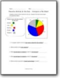
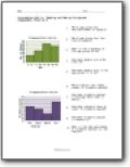
Pie (Circle) Charts
We learn to use this type of graph to analyze parts of a whole data set or organization. Learn how to both interpret and create them.
Visual Graphing
A series of nice and simple graphing activities to introduce and engage students in the spirit of graphing.